Decorating your home can be both exciting and overwhelming, but most of all, it’s rewarding. Although interior design trends come and go relatively quickly, you don’t have to follow them all in order to have a well-designed home. Whether you’re an expert designer or new to decorating, it’s important to know the reasons why you should mix and match prints and solids in design. Dive into the wild world of interior styling and create the home of your dreams.
It Adds Variety and Dimension to Your Design
Many people believe they have to choose one pattern or color and utilize only that option throughout an entire room or even their whole house. However, this idea couldn’t be further from the truth; in fact, you can get more out of your design and décor by pairing different prints, patterns, textures, and colors. When you use only one pattern or color, your interior design will lack substance and statement. Alternatively, pairing prints with solids adds variety and dimension to your overall aesthetic.
For instance, gray can be a rather bland color, but you can make it more attractive by adding patterns and textures that incorporate the color. Furthermore, pink is an adorable color for your child’s room, but pairing it with polka dots or cow print can give the room a stronger visual appeal.
You Can Find Opportunities To Change Aesthetics
If you’re someone who likes to change your home décor frequently, you should definitely pair various colors and patterns together. When you have only one color to work with, it’s much more difficult to create a fresh new design. On the other hand, having three or more colors and patterns in your design can make it much easier to simply switch out a few décor items to develop a new design.
As an example, if your room consists of gray, red, and gold accents, you can swap the gray for green and create a beautiful Christmas design, or switch it out with orange for an unbeatable fall aesthetic with little to no effort. On a different note, you can transform your blue, yellow, and seashell print beach design into a blue winter style by simply trading the yellow for silver and the seashell print for a pine tree pattern.
It Creates a Visual Balance
When you opt for one color and one pattern, your room design may feel unbalanced or like it needs something more. Luckily, you can add another color or print to create visual balance. With that in mind, it is possible to mix too many colors and prints, which may result in an overwhelming and unorganized design. Don’t use more than three colors and three patterns in any one room or area of your home if you want to avoid pairings that aren’t well coordinated.
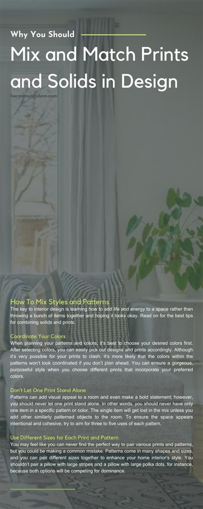
How To Mix Styles and Patterns
Now that you know why you should mix and match prints and colors, it’s time to learn the best ways to do so, with a few tips for making it look natural and purposeful throughout your house. The key to interior design is learning how to add life and energy to a space rather than throwing a bunch of items together and hoping it looks okay. Read on for the best tips for combining solids and prints.
Coordinate Your Colors
When planning your patterns and colors, it’s best to choose your desired colors first. After selecting colors, you can easily pick out designs and prints accordingly. Although it’s very possible for your prints to clash, it’s more likely that the colors within the patterns won’t look coordinated if you don’t plan ahead. You can ensure a gorgeous, purposeful style when you choose different prints that incorporate your preferred colors.
For instance, if you opt for a gray contemporary couch,you should select throw pillows and blankets that incorporate a shade of gray. Coordinating your colors is very beneficial when combining various designs and patterns.
Don’t Let One Print Stand Alone
Patterns can add visual appeal to a room and even make a bold statement; however, you should never let one print stand alone. In other words, you should never have only one item in a specific pattern or color. The single item will get lost in the mix unless you add other similarly patterned objects to the room. To ensure the space appears intentional and cohesive, try to aim for three to five uses of each pattern.
Use Different Sizes for Each Print and Pattern
You may feel like you can never find the perfect way to pair various prints and patterns, but you could be making a common mistake. Patterns come in many shapes and sizes, and you can pair different sizes together to enhance your home interior’s style. You shouldn’t pair a pillow with large stripes and a pillow with large polka dots, for instance, because both options will be competing for dominance. Instead, you should choose the style you want prominently displayed, then select another print in a smaller size to put next to it.
The Ultimate Print and Pattern Pairings
If you’re unsure where to start when pairing prints, patterns, and colors, we’ve compiled some of the best options to help you get started. Although combining patterns should always be a personal preference decision, it’s good to know what goes together and what doesn’t. Consider several pairings that have stood the test of time:
- Florals and Stripes
- Stripes and Polka dots
- Florals and Polka dots
- Animal print and Polka dots
- Leopard print and Stripes
- Cow print and Florals
When it comes to choosing solid colors to offset your patterns, you should opt for one of the colors from the pattern to avoid clashing. For instance, if you choose a pink, green, and yellow floral throw pillow for your sofa, you should also select a solid throw pillow in pink, green, or yellow, depending on your preferences.
After learning why you should mix and match prints and patterns in design,you’ll be able to create stunning and purposeful home aesthetics with little to no effort. Although some prints and patterns do clash, you can prevent undesirable mismatches by choosing different pattern sizes that use similar colors.